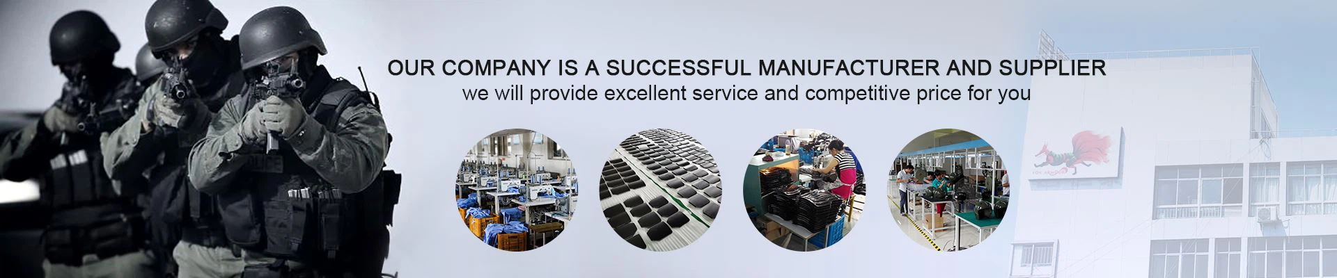
The color and appearance of riot gear are deliberate tactical choices, balancing intimidation, visibility, and professionalism. Traditional riot gear is often in high-visibility colors like black, dark blue, or white. This creates a unified, imposing "robocop" image that projects authority, control, and a clear distinction between law enforcement and the crowd. The monochromatic, dark appearance also helps conceal dirt, paint, and other debris thrown during a riot, maintaining a professional image throughout a long operation. In contrast, some units now employ low-visibility or "soft" uniforms for certain public order scenarios. These may use muted colors like grey, green, or even regular patrol uniforms. The goal is to de-escalate the visual tension, presenting a less confrontational and more community-oriented presence. This is often used for community policing at large events where a full-scale riot is not anticipated. The choice is strategic: high-visibility for maximum deterrence and control in a volatile riot; low-visibility for a less provocative presence during public order maintenance.
Core Knowledge:
High-Visibility (Traditional): Colors like black and navy blue project authority, form a unified and intimidating front, and are practical for concealing wear and tear from debris.
Low-Visibility (Modern De-escalation): Muted colors or standard uniforms are used to present a less confrontational image, aiming to reduce tension and avoid provoking a crowd.
Tactical Intent: The choice is a command decision based on the mission: high-vis for crowd control and barrier defense; low-vis for presence patrols and situations where de-escalation is the primary goal.
Identification: Even low-vis gear will still feature clear unit identification and rank insignia, ensuring accountability and command structure is maintained.